Design language 设计语言
One stylesheet for every page. It replaced, per page, Bootstrap, MDBootstrap, FontAwesome, academicons, two syntax-highlighting themes and a webfont from a CDN — all of it, with hand-written CSS. 一份样式表服务所有页面。它替掉了每个页面各自加载的 Bootstrap、MDBootstrap、FontAwesome、academicons、两套代码高亮主题,以及一个 CDN 网络字体 —— 全部换成手写 CSS。
Two colour layers, no third 两层颜色,没有第三层
Ink and one blue. Everything else is those two thinned down: the secondary and tertiary inks, the paper tint, and the hairline rules, which are ink at 10% and 18%. No per-page accent colours. 墨色,加一种蓝。其余全部由这两者稀释而来:二级与三级墨色、纸面底色,以及分割线 —— 那是 10% 和 18% 的墨。不再为每个页面单独配主题色。
-
--ink#16181d
-
--ink-2#3c4148
-
--ink-3#6b7280
-
--accent#0076df
-
--paper-2#f7f6f4
Principles 设计原则
-
Scale, not ornament 用尺度,不用装饰Weight comes from size and empty space. A heading earns its authority by being large and alone, not by acquiring a border, a shadow and a badge. 分量来自尺寸和留白。一个标题的权威感靠够大、够孤立,而不是靠再加一道边框、一层阴影和一个角标。
-
Serif for display, sans for reading 标题衬线,正文无衬线Source Serif 4 carries every title; the body is the system sans. Monospace is reserved for what is actually code. 所有标题用 Source Serif 4,正文用系统无衬线体。等宽字体只留给真正是代码的地方。
-
Hairlines, not boxes 用细线,不用盒子A single rule separates what a card used to enclose. Corners stay square — the only round things on the page are dots and pills. 一条细线就能分开原本要靠卡片圈住的内容。转角保持方正 —— 页面上唯一圆的东西是圆点和胶囊标签。
-
One measure 统一的阅读宽度Prose is capped at 62 characters and every page shares the same shell, so a reader's eye lands in the same place on arrival, whatever the page. 正文宽度锁在 62 个字符,所有页面共用同一副外壳;无论进哪一页,视线落点都在同一处。
-
Zero frameworks 零框架Hand-written HTML/CSS/JS, and a check that fails the build if a framework or a CDN font sneaks back in. Every byte on the page was put there on purpose. 纯手写 HTML/CSS/JS,并且有一项检查:只要框架或 CDN 字体偷偷回来就报错。页面上的每一个字节都有它存在的理由。
-
Motion earns its place 动效物尽其用Reveals on scroll and cross-document view transitions — always subtle, always skippable via reduced-motion. 滚动渐显,以及跨页面的视图过渡 —— 始终克制,且始终尊重减少动效偏好设置。
The language this replaced 它替掉的那套语言
The earlier site ran five accent colours — one per surface — set everything in monospace, and put every block in a card with 12px corners and a soft shadow. It was cramped: a 720px measure, hairlines everywhere, 11px uppercase labels that read as variable names rather than headings. Scale replaced all of it. The one part that survived is the panel system — native scroll-snap with no carousel library, two axes, vertical between chapters and horizontal within them — which still drives the maps page.
上一版网站用五种主题色 —— 每个页面一种,全站等宽字体,每一块内容都装在 12px 圆角带柔和阴影的卡片里。它太挤了:720px 的正文宽度、到处都是细线、11px 全大写标签读起来像变量名而不是标题。后来用尺度把这些全部换掉。唯一留下来的是面板系统 —— 原生 scroll-snap,不用轮播库,两个方向:章节之间纵向、章节之内横向 —— 它现在还在支撑地图页。
-
--theme#0076df
-
--moss#556b2f
-
--amber#ffc24d
-
--warm#b3542e
The mark 标志
An osmanthus tree in a ring, standing in a brook that runs to the left. Drawn by a script, not by hand — scripts/brand/generate_mark.py is the master, every file under /assets/brand/ is its output, and the whole drawing is seeded so re-running reproduces it byte for byte.
环里一棵桂花,脚下一道向左流的溪水。它不是手绘的,而是脚本画的 —— scripts/brand/generate_mark.py 是唯一母版,/assets/brand/ 下的每个文件都是它的输出;所有随机都带种子,重跑一次能得到字节一致的结果。
桂花 — drawn to the botany 桂花 —— 照着植物学画
Osmanthus fragrans, and the drawing follows how it actually grows: leathery lanceolate leaves in opposite pairs, tiny four-petalled florets clustered in the leaf axils and never at a branch tip, dew only on the lowest leaf tips where it would really collect. 112 leaves, 18 clusters, 6 beads. In Chinese the tree carries 折桂 — plucking the osmanthus, an old figure for an achievement earned. 桂花(Osmanthus fragrans),画法照着它真实的生长习性:革质披针形叶严格对生;四瓣小花簇生在叶腋,绝不长在枝顶;露珠只挂最下层叶尖 —— 那才是露水真正会积的位置。112 片叶、18 簇花、6 颗露。中文语境里它还连着「折桂」,是靠本事换来的成就。
潺潺流水 — and how a still drawing points left 潺潺流水 —— 一张静止的画怎么指出流向
Monochrome, static, no arrowhead and no second colour. Direction has to come out of the shapes themselves, so four cues are stacked and none of the reading depends on one trick: 单色、静止,没有箭头也没有第二种颜色。流向只能由形状本身说出来,所以叠了四种线索,不让判断落在任何单一技巧上:
- Taper. Every ripple thins to nothing at its left end. The thick end is where the water came from — which is why the ripples are filled shapes rather than strokes: only a fill can end in a real point. 收尖。每道水纹向左收成无穷细,粗的那头是水的来处。这也是水纹用填充而非描边的原因 —— 只有填充能收出真正的尖。
- Wake. A stone parts the flow and its wake opens downstream, to the left. The most literal cue in the drawing. 尾迹。一块石头把水分开,尾迹朝下游、也就是朝左张开。整张图里最直白的一条线索。
- Curl. An eddy hooks over at the downstream tip, in the direction of travel. 回涡。下游端一个小卷,顺着水走的方向兜回来。
- Grading. The rows shorten and thin as they go, the way a shallow brook frays out instead of stopping. 疏密。越往左越短越细,像浅溪散开,而不是齐齐截断。
Three stages 三步演进
The water needed space, not finer linework. The first version left 18 of the 200 canvas units between the trunk base and the ring, and the interior is only ±28 wide down there — anything drawn into that slot is a grey smudge by 96px. Fitting the same tree smaller and higher opened 36 units, and the 32px icon reads better for it, the crown being less crowded. 水缺的是地方,不是更细的笔。第一版在树干落地处到圆环之间只留了 18 个(共 200)画布单位,而且那个高度上内圆只有 ±28 宽 —— 任何水纹塞进去,到 96px 就是一团灰。把同一棵树缩小、上移,让出 36 单位,32px 反而比原来更清楚,因为树冠不再挤。
-
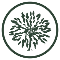 study原型
1 · Closed ring, no water 一 · 环闭合,无水
The tree filling the ring edge to edge. A whole mark on its own, and the shape the water had to find room in. 树把圆环撑满。它本身已经是完整的一枚标志,也是水要在其中找位置的那个形状。
-
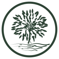 icon图标
2 · Lifted, with a real brook 二 · 抬树让水
Same tree, smaller and higher, four tapered ripples and a stone in the band it vacated. The ring stays shut on purpose — that closed outline is what still reads when the tab is 16 pixels wide. 同一棵树,缩小上移,让出的水带里放四道收尖水纹和一块分水石。环刻意保持闭合 —— 标签页只有 16 像素宽时,还能读出来的正是这个闭合轮廓。
-
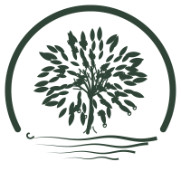 display展示
3 · Water as the base 三 · 水托
The ring stops where the water starts and the stream closes the circle, so the mark stands in the current rather than above a decoration. It earns that break only at size: by 32px the outline no longer reads as a circle, so this one is for 128px and up. 环在水面处断开,由水来收口,于是标志是立在流水里,而不是站在一处装饰上方。这个断口只有在大尺寸才划得来:到 32px 轮廓已经不像圆了,所以它只用于 128px 以上。
-
Icon, every size 图标,全尺寸The closed-ring version is the favicon, the apple-touch-icon and the web app manifest icon, with the 192 and 512px rasters downsampled from it. 环闭合的那一版是 favicon、apple-touch-icon 与 Web App manifest 图标,192 / 512px 光栅图由它下采样得到。
-
Display, from 128px 展示,128px 起The open-ring version is for places with room to spare — headers, social cards, slides, print. Not for a favicon: the break needs size to make sense. 环断开的那一版用在放得开的地方 —— 页头、社交卡片、幻灯片、印刷。不做 favicon:那个断口需要尺寸才立得住。
-
Rasters come from the vector 光栅图来自矢量Rendered once at 1024px and downsampled with LANCZOS, never drawn straight onto a small canvas: that keeps a sub-pixel stroke as partial alpha instead of dropping it, so the detail survives as grey density. 先渲染到 1024px,再用 LANCZOS 下采样,绝不直接画在小画布上 —— 这样比一个像素还细的笔画会留成半透明的灰,而不是整根消失。
-
One artwork, two compositions 一份图稿,两种构图The two versions call the same drawing routine; what differs is the ring and the water. There is no separately redrawn small version — a detailed drawing downsampled beats a simplified redraw, and one source is easier to keep honest. 两个版本调用的是同一段绘制代码,区别只在环和水。没有另画一版简化的小图 —— 细节图下采样的效果好过重画的简化版,而且单一来源更容易保持诚实。
Cartography 地图绘制
Hand-drawn SVG maps from /maps — every coastline, peak, and ferry route is a path I plotted. 来自 /maps 的手绘 SVG 地图 —— 每一条海岸线、每一座山峰、每一条渡轮航线,都是我亲手绘制的路径。
Anatomy of a panel map 一幅面板地图的解剖
- A rotatable D3 globe greets you first — countries fill in as they're visited, cities pin with tooltips. 首先迎接你的是可旋转的 D3 地球仪 —— 到访过的国家逐一填色,城市图钉带有悬浮提示。
- Scroll down, and the world zooms in — a full-viewport Pacific Northwest chart snaps into place with a fade-and-rise reveal. 向下滚动,世界随之放大 —— 一幅满屏的太平洋西北地区海图以渐显上升的方式吸附就位。
- Swipe right for route charts — Salish Sea ferry crossings drawn like an old nautical map: anchors, whales, sea-siren medallions. 向右滑动查看航线图 —— 萨利希海的渡轮航线画成旧式航海图的模样:锚、鲸鱼、海妖徽章。
- Everything is inline SVG — no tiles, no map API. Peaks get elevation labels; unvisited ones fade back politely. 一切都是内联 SVG —— 没有瓦片,没有地图 API。山峰标注海拔;未到访的则礼貌地淡入背景。
- Dots, chevrons, and edge handles guide the way — the same navigation grammar reused across the whole site. 圆点、箭头和边缘把手指引方向 —— 与全站复用同一套导航语法。
Photography 摄影
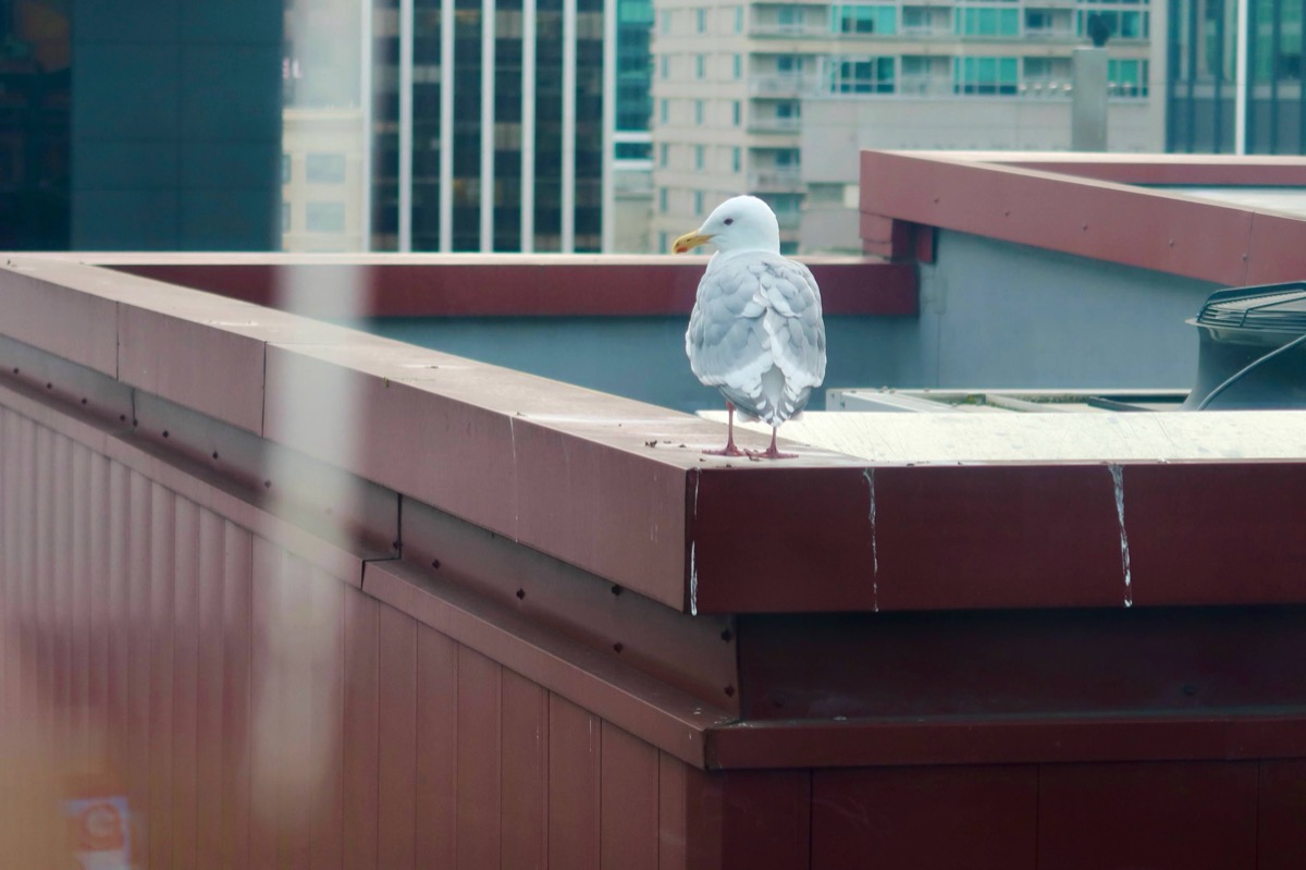
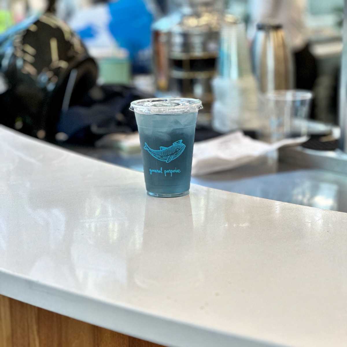
Frames from the road — coastlines, workbenches, small delights. 旅途中的画面 —— 海岸线、工作台,和那些小发现。
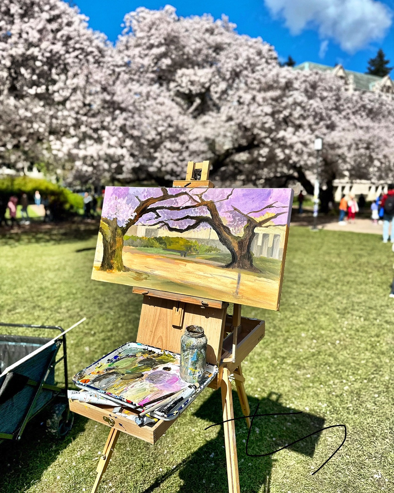
Reels 短片
Short cuts, 9:16 — sketchbooks, islands, and street corners. 9:16 竖屏短片 —— 速写本、海岛与街角。
More reels on Instagram — @lazypppppppp 更多短片见 Instagram —— @lazypppppppp →